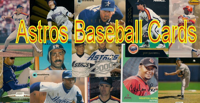
I decided to make the banner at the top a little more flashy. I'll be the first to admit that my Paint Shop Pro skills are severly lacking. I've been using this program for about five years but mostly for resizing pictures and adjusting the color.
Last night I tried a little experiment by dumping some cards on the scanner. It worked out pretty good but there were some gaps. I dropped some more cards on the scanner this morning and redid the text, using the color scheme from the old uniforms.
As I mentioned, I have no idea how to use this program; I bet I only know my way around about 25% of it. Regardless, I did my best by trial and error and this is the result.
So don't laugh.
Michael Sheard
16 years ago


Actually, it looks great.
ReplyDeleteThank you. Everyone else's seems to look better than mine. I guess I'm my own worst critic.
ReplyDeleteIt looks very nice. My problem when I made mine was wanting to make the blog name big, but not too big.
ReplyDeleteI like it. I should do something similar for my Giants blog.
ReplyDeleteThanks. It's weird...it actually looks clearer before I added the words...now Giusti and a few others look fuzzy. Might have to work on it when things calm down at work.
ReplyDeleteResized the banner pic but didn't resize the pixels measures...or something like that. Now the cards don't look grainy. Maybe next time I'll scan some of my favorite cards instead of just a random handfull pulled from a box.
ReplyDeleteHey, it's just been an experiement. I guess you can teach an old dog new tricks.